Mapping the Questions
Historians are turning to new mapping technologies to visualize and investigate the past — by layering primary documents, heaps of data and historic imagery to create a spatial history of communities or cities in time. Rice scholars are at the forefront of this burgeoning field.
Spring 2017
By Allyn West
A MAP OF HARRIS COUNTY glows on Kelsey Walker’s computer screen. The arbitrary political boundaries of the county show up as thin black lines, containing the infinity loops of Houston’s freeways and the scratchy paths of its bayous.
Most maps might stop here. Flat. Static. Passive. But Walker’s map, when activated by the clicks of her mouse, becomes almost a century long and a dozen layers deep, fed by a vast cache of data that she mined from the Harris County Appraisal District’s nearly 2 million property tax records. The map allows her to visualize the history of housing in the city. With a click, she can see where single-family homes have been built. From there, she — or any other researcher with access to these tools — can start to ask questions about sprawl, gentrification or deed restrictions.
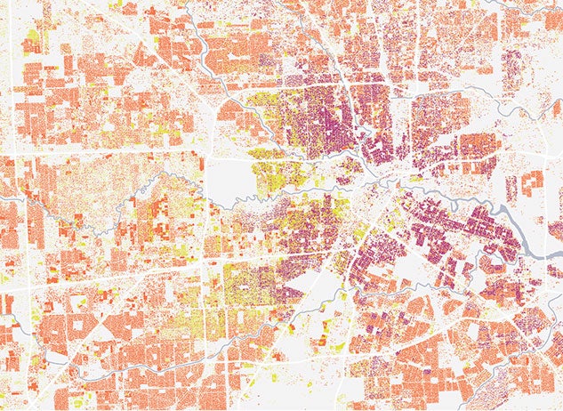
A former staff researcher in urban development, transportation and placemaking with the Kinder Institute for Urban Research, Walker said that mapping has become no less than a new way to think. “I use maps all the time as ways to generate hypotheses,” she said. “They get the wheels turning a lot faster. I can see a million housing units in a way I can’t understand a table with a million rows.”
Walker earned an economics degree from Rice in 2015. As an undergraduate, she developed an interest in GIS, or geographic information systems, and the computer programs — ArcGIS, StoryMap, Juxtapose, Timeline — that support it. In her sophomore year, she took a workshop through the Humanities Research Center (HRC) that introduced her to the intricacies of what’s becoming an increasingly popular, and increasingly useful, set of skills for scholars and researchers like her in the social sciences and humanities.
This is especially true at Rice, where the so-called “spatial humanities,” which incorporate new geographical technologies into disciplines like history, art and literature, are enjoying an ascendance. Though mapping itself is as old as the desire to explore, the kinds of tools Walker uses now are changing the way research and scholarship are done, opening up possibilities for collaboration across these disciplines.
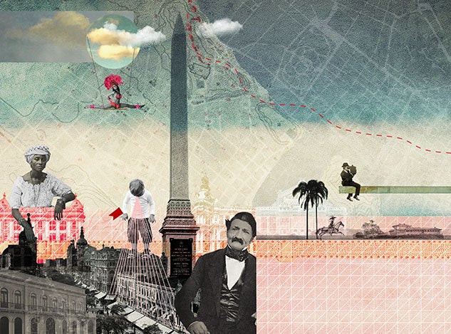
One of the first projects to put Rice on the cartography map is “imagineRio,” an open-ended, web-based “cartographic platform” of the populous Brazilian city. The platform was co-created by professors Alida Metcalf, chair of the history department, and Farès el-Dahdah, director of the HRC, where Walker got her start.
“The project began with the idea for an exhibit: pictures on a wall,” Metcalf said. In 2011, while teaching a course in Brazilian social history and architecture, the two professors found that their students, many of whom could not read or speak Portuguese, could work successfully with digital primary sources. That led to the assignment of research projects that had the students learn how to geolocate high-resolution imagery and prepare visual arguments. (Geolocate means to digitally assign information, such as latitude or longitude coordinates, to an address, a person or an object.)
“These projects helped us envision how to design ‘imagineRio’ so that it can be used by students and scholars,” Metcalf said.
Today, “imagineRio” is an expanding archive poised at the intersection of space and time. It uses GIS to geolocate city plans, architectural drawings (both of realized buildings and abandoned projects), archival images from Brazil’s national library and scanned maps from the entire course of the city’s history, from 1500 to today. The web project looks as simple as a Google map, but that apparent simplicity belies its power.
As with Walker’s map of Harris County, “imagineRio” users can single out geographic features, such as rivers or beaches, buildings and streets, or even iconography such as watercolors, sketches or paintings. A slider at the top of the map allows users to speed forward or backward in time. If you wanted, you could study the evolution of a single marsh over the course of 516 years. Or you could watch where Rio developed its cemeteries, parks or hospitals.
Today, “imagineRio” is an expanding archive poised at the intersection of space and time. It uses GIS to geolocate city plans, architectural drawings (both of realized buildings and abandoned projects), archival images from Brazil’s national library and scanned maps from the entire course of the city’s history, from 1500 to today.
Metcalf’s research into the social history of Rio examines the way the movement and management of water has perpetuated institutions such as slavery. Building this platform was, for her, the best way to answer her questions. “We needed to create this space where we could start to approach this new kind of history of the city,” she explained.
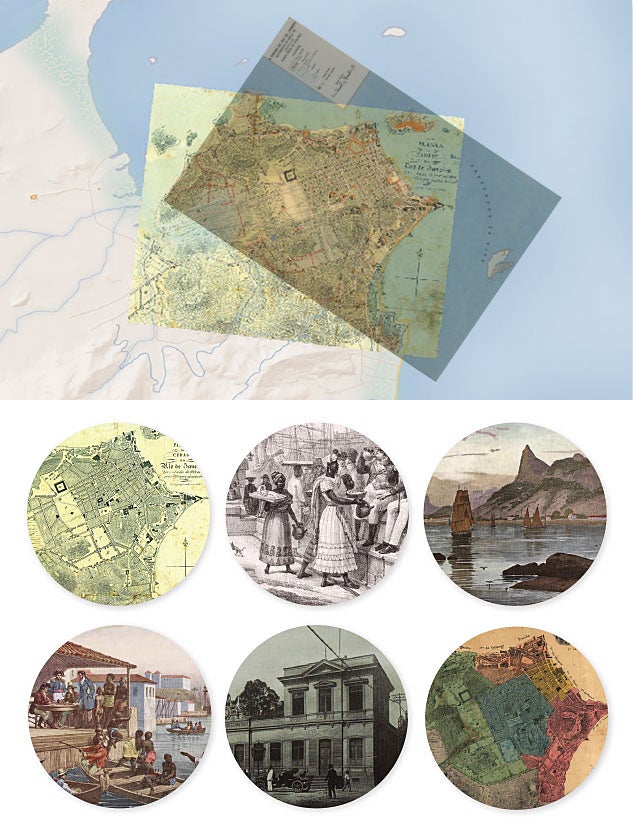
With imagineRio, El-Dahdah said in a recent department talk, “You can see what the cartographer saw in 1818.” In this sense, the project helps el-Dahdah study how Rio “imagined itself.”
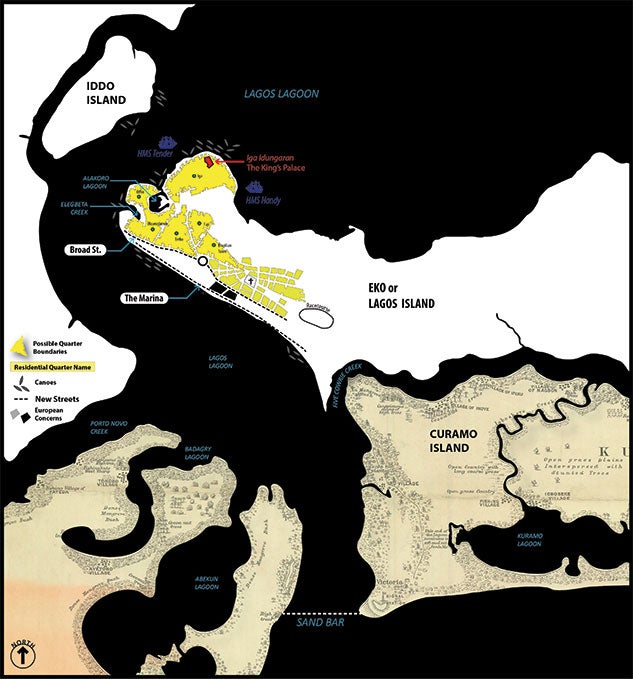
As “imagineRio” continues to expand — by building its collection of imagery and inviting Brazilian scholars to collaborate on the project — so does its influence. Postdoctoral fellow and historian Ademide Adelusi-Adeluyi credits it with heightening her sense of the possibilities of GIS and maps for teachers and researchers in the humanities.
Her own work uses colonial maps to tell a new spatial history of Lagos, Nigeria. At first, she admitted with a laugh, she thought “maps were there for decoration.” But she learned some of the same tools that Walker learned and that el-Dahdah and Metcalf have incorporated into their project, and “the tools shaped my questions,” she said, adding that she realized “I can do more than write. I can also draw.”
Along with anthropologist and HRC postdoctoral fellow Shannon Dugan Iverson, she is teaching a new Rice course in the spatial humanities. The students, who include an urban planner, an economist, a political scientist and a civil engineer, have developed research questions they can answer by creating a map. They are practicing not only how to put data to use — and learning the technology required — but how to read and think critically about maps.
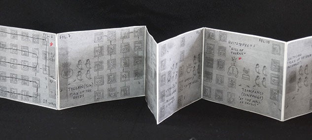
“There are these ideas [about cartographic practices] that come from colonialism of completeness, accuracy, control,” said Iverson, who carries in her bag a handmade miniature of a 500-year-old Aztec codex that documents a history of migration she is translating into digital form.
“Territory is seen as a static thing that never changes and is never in conflict.” In response, Iverson and Adelusi-Adeluyi stress the creative, pushing their students to retain what they say the humanities have always been about: storytelling.
Though the ascendance of these mapping technologies raises issues of access and literacy, which some believe casts doubt on the so-called democratization of data, it also creates many possibilities for researchers and scholars to pursue new questions and new answers to the old ones. It represents a new way that big ideas born in the academy are finding audiences beyond those walls, where they might have remained hidden in the pages of a peer-reviewed journal. Indeed, the spatial humanities might be said to be leading the way at a moment of greater collaboration and greater public engagement at universities than ever before. Maps, after all, help us navigate the world.
New Cartographies
TRACKING THE "MORTALITY TRANSITION" IN NEW ORLEANS
By the end of the 1950s, American life expectancy was up and infant mortality was down, according to Wright Kennedy, a doctoral candidate in history at Rice. There was more economic prosperity for more people than ever before. These conditions were lumped into a kind of progress narrative referred to as the “mortality transition.” It indicated, or seemed to indicate, “that the rising tide lifts all boats,” Kennedy said.
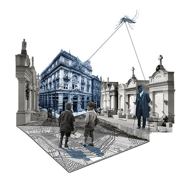
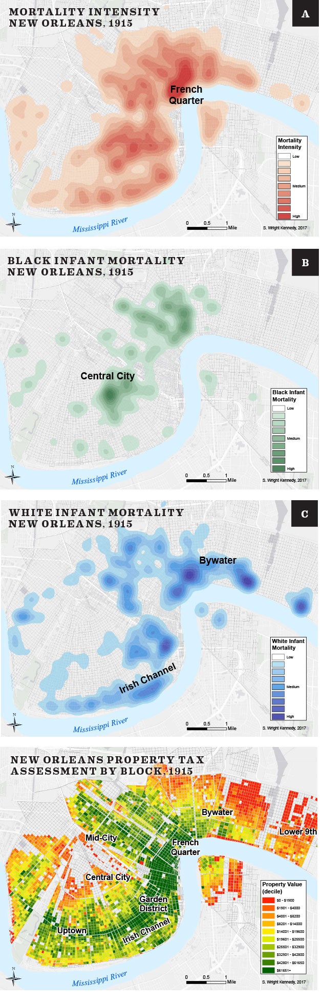
Kennedy questioned that. Could it be true for everyone, everywhere? He had previously studied the yellow fever epidemic in Memphis, using GIS to map incidences of the spread of the disease throughout the city and to show its impact on public health.
Now, he has turned his attention to turn-of-the-century New Orleans. Narrowing his inquiry to the period between 1880 and 1915 and pulling from fire insurance maps, property tax records and hand-recorded demographic data from 200,000 death certificates, Kennedy has created a fine-grained picture of mortality in the Crescent City. His maps show the ethnicity of each person who died. They show the “intensity” of mortality in African-American neighborhoods compared with white neighborhoods. They even show the rate of death by tuberculosis. These maps, some of which Kennedy has published online, allow him to refuse to take the mortality transition for granted and to show how it unfolded in a particular place and time.
“I’ve always been a visual person,” he said. And he’s interested in the ways these visuals open up so many possibilities, both as tools for researchers and as means of communication with broader audiences. They embody “the connection between quantitative and qualitative frameworks,” for one, he said, but they also allow other researchers to come in, after the fact, and ask even more questions across many disciplines.
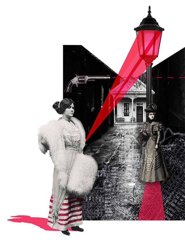
RACIAL POLITICS AND HOUSTON'S RED LIGHT DISTRICT
In the early 1900s, the city of Houston wanted to clean up its downtown. An informal Red Light District known as Happy Hollow, where the Theater District now stands, was rife with sex, drugs and gun violence. In 1908, at the urging of business owners, a formal Red Light District was established just west of downtown in Freedmen’s Town — home to some of Houston’s first African-American property owners.
Though this relocation might be considered an improvement for downtown, Brian Riedel is interested in the impact it had on Freedmen’s Town. Riedel received his Ph.D. in anthropology from Rice in 2005 and now is a humanities professor and assistant director of the Center for the Study of Women, Gender and Sexuality. He’s wondering how the city’s decision affected property values and displacement in that historic neighborhood.
To answer his question, Riedel turned to GIS. Creating maps that pull from census data and church records, Riedel is discovering who was living in the newly formed district and whether — and how — they resisted the change. Did their property values drop? Did they move or did they stay? How did that decision affect the composition of the neighborhood going forward? “Racial politics and sexual propriety have left an indelible mark on the city,” he said, “and here’s the scar.”